You know sometimes I find that right after the new year comes we are energized with thousands of online predictions of what 2016 is going to bring us. I mean really, only a small few of those predictions really pan out by the end of the year. But the one prediction that I read in Mashable’s magazine last year early January that stated, “experts said that 2015 was the year of responsive design for mobile devices”. They were right on the mark! As designers we have been seeing this coming but now the business owners are seeing the crunch in their business . Their web traffic is dropping! Why you ask?
I mean think about it! What device to you have at your fingertips more than another other. Your cell phone, right? and think about these facts: In 1983 the first mobile phone was looked like this picture. The Motorola Dyna Tac 8000x which was a far cry from the NEW I phone 6 of today.
Only a few people could get a hold of mobile phones back than. Today, almost everyone has mobile phones and smart phones like the Iphone or Android at that! Modern technology has given more and more people the access to, not just ordinary mobile phones, but high-technology smart phones and along with it, online connectivity. What does that mean for web design?
The Birth of Responsive Web Design
These days, people are no longer confined to using computers or laptops to view pages online. With the rise in the production of tablets and smart phones along with the number individuals who use these gadgets, responsive web design was born.
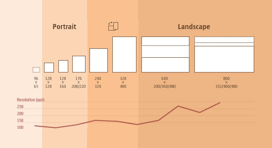
Smart phones obviously have much smaller screens and viewing traditionally designed online pages can be a hassle. You know that an online page has responsive web design when you don’t have to do anything to enjoy the page you’re viewing! The page adjusts to whatever device you are using to help you better appreciate the page you’re looking at. This is possible by making use of “media queries” which are responsible for figuring out what device the page is being viewed with.
Simply put, responsive web design or RWD is an approach to website design where the primary concern is to optimize the viewing experience of anyone using any kind of device. Online pages are given their optimal viewing experience without the need to manually adjust screen resolutions or other settings.
It Is Important To Know Difference With A Responsive Web Design
Pages which make use of responsive web design have flexible features; they don’t have fixed width settings which will limit the viewing pleasure of individuals visiting a page using smaller devices. With responsive website design, a page automatically adapts to the style smaller devices need to effectively present whatever there is on a page while maintaining most of the original page’s look and functionality.
When you make use of a page with responsive website design, you are catering to the demands of mobile Internet users. These individuals appreciate pages which are easy on the eyes regardless of whatever device they are using!
If you limit yourself to using a website which isn’t responsive, you will fall behind the fast-paced world of technological advancement and your website visitors will notice that as well. Don’t make them lose interest in your page.
Switch to the New Norm!
Keep your online followers with you and gain more traffic to your website by adjusting to the times and by making use of responsive website design to take care of their mobile browsing demands with your business website. If you don’t have this type of website your are loosing big dollars in your business. Present your business in an effective way to a wider audience. With responsive website design, anyone who has access to the Internet can enjoy browsing your page hassle free on any device and will keep coming back for more!
Word of caution: If your designer doesn’t suggest an responsive website for your business than do yourself a favor and ask more questions and maybe talk to another designer. You need a responsive website in today’s lifestyle. It is the best bet and your best value with a WordPress Site. Contact us for more information.
